This project brought together several things I enjoy: design, community, and good beer. I created the logo and branding for the organization, which wasn’t always easy given the nature of the feedback process. But we found our stride, and the brand turned into a solid one, and one which gives me pride in that I used a relatively generic motif (the sign) and still managed to create something fun and memorable.

The co-op broke up and eventually led to the founding of Six Car, which I played an early role in branding, but I’m proud to have worked on this and hope that the group can at some point find a way to re-emerge.

Case-Study-Yellow-City-BP-02
As always, no matter the detail level of the logo, my insistence on one-color viability allows for economical and cool swag.
Case-Study-Yellow-City-BP-03
The fact that the board of YCBP required the 66 sign in the logo, along with the fact that a plan for re-animating historic downtown, allowed for some fun, triumphant graphics.
Case-Study-Yellow-City-BP-04
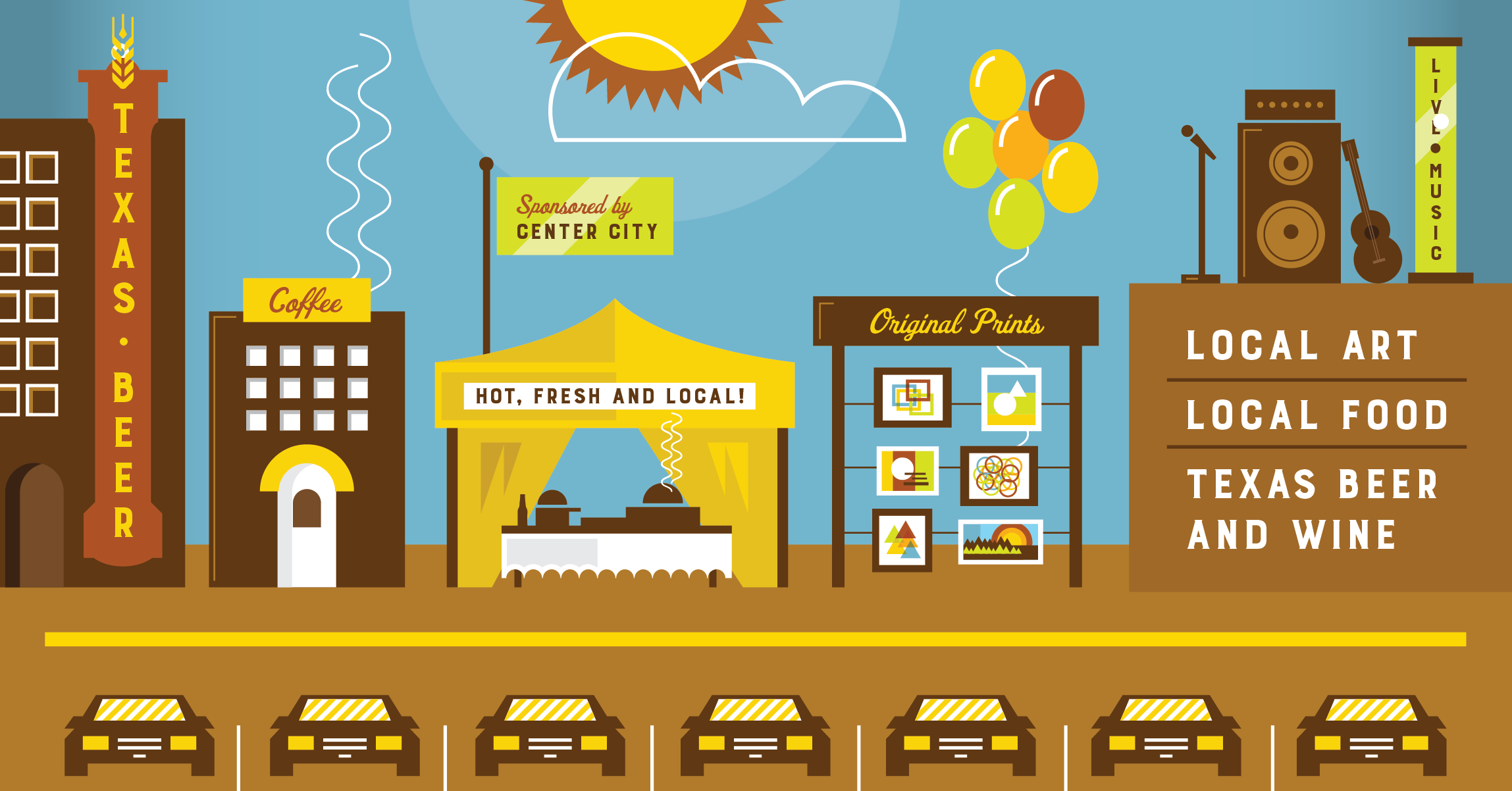
The Craft festival which was the first big announcement of the organization to the city. Appropriately busy but accessible graphics were created to announce it.
Case-Study-Yellow-City-BP-05
The logo for the Co-op lent itself to the logo and graphics for the festival, and the logos and items which bear them clearly are part of the same family.