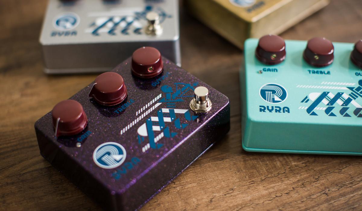
Shane from RYRA came to me for some graphics for his— as it stood and still does now—best replication of the ubiquitous Klon Centaur guitar pedal. That kinda sounds like a straigh-forward task, yeah? Not so much.

RYRA stands for Rock Your Repaired Amp and [sip coffee while you wait…]. I’m not joking. Naturally, I vehemently lobbied for a name change, but there was no budging. So I took a different tact; ignore what it means, and focus on the phonetics of the abbreviation and the reality of what the product was.

The resulting graphics, logo and font all pack a ton of insider information within a visually poignant robot centaur graphic, as well as a genre-appropriate typographic identity.

Case-Study-RYRA-04
Rock Your Repaired Amp produces excellent versions of the much-hyped Klon guitar pedal. The challenge here was to retain something of the name; in this case, we used the initials, whose phonetics lead me to this retro-tech approach to the look. The robot centaur created has become a logo unto itself and a bit of a legend.
Case-Study-RYRA-03
The challenge as I saw it was to create work that was as odd as the phonetically awkward name of the company. Along with graphics, I made an appropriately ugly font in two styles.
Case-Study-RYRA-02
When the client decided to begin selling guitars as well, it quickly became apparent that the natural stylings of classic guitar decals were at odds with the style created for the pedals. Here you see attempts at giving the guitars their only style. The bottom row shows my favorite version of completely abandoning the whole “Fender” thing in liue of something more shocking.
ryra-headstock-photo
I certainly do not think that the customer is always right. Rather, a satisfied customer is the goal. However, I do admit that this iteration feels more...headstock-y. That's a technical term. Look it up.