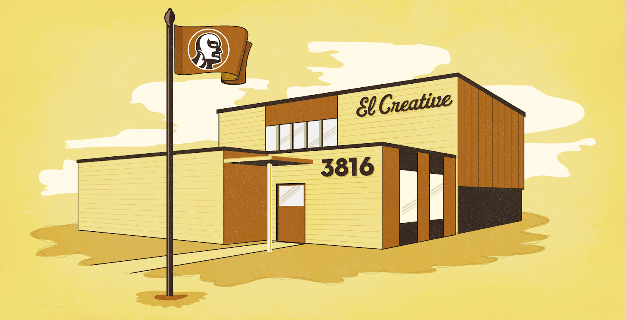
El Creative, my first and only long-term studio gig, was an amazing experience. There was no bureaucracy; everyone did everything, and the best solution won. When I interviewed, I noticed the Luchador graphics outside and the funky pylon sign.
Looking back, the execution wasn’t amazing (hence my re-design), but it was the most interesting thing to see on Commerce Street and arguably in Deep Ellum.
The challenge for me, which I introduced myself, was to elevate our brand to our evolving clientele, which had moved beyond mom-and-pop shops to companies like Toyota, Univision, Wingstop and HGTV.
This logo, though it’s not technically as difficult or amazing as some others I’ve done, is one of my proudest for several reasons:
- I initiated it from my own intuition (being the most junior designer).
- The mark embraced the company’s roots while moving forward.
- We didn’t have to throw away anything as a result of the enhancement.
- Company-sustaining contracts came from sightings of this logo.


